Are you aware of the fact that 70% of ecommerce shopping carts get abandoned?
Cart abandonment occurs when your potential customer leaves your site before completing the checkout process, and it means you miss out on another potential sale.
To put the scope of this problem into perspective, if your ecommerce store generates $150k per month in revenue, that means you’re potentially leaving $350k per month on the table due to abandoned carts.
That’s mucho dinero, muchacho.
And what’s worse is that cart abandonment rates have remained constant despite numerous advances in user experience design:
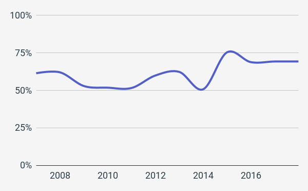
Sure, a certain amount of last-minute abandonment is expected—it’s just a part of human nature.
However, you can always improve the strategies you use to engage and convert your Shopify store customers to recover a good portion of that revenue—while collecting valuable customer feedback to improve your buying process and marketing efforts.
So let’s help you do that.
In this article we’ll cover:
- The reasons why customers abandon their cart
- The way to calculate your abandoned cart percentage
- The best practices for cart abandonment email campaigns
And
Let’s get started, shall we?
Why customers abandon their cart
If you don’t know why a problem is occurring, it’s impossible to overcome it. That’s why it’s so crucial to know the reasons why customers are abandoning their cart on your site. That way you can make the right adjustments and get deeper insights into their objections and concerns.
So let’s take a look at the top reasons for cart abandonment:
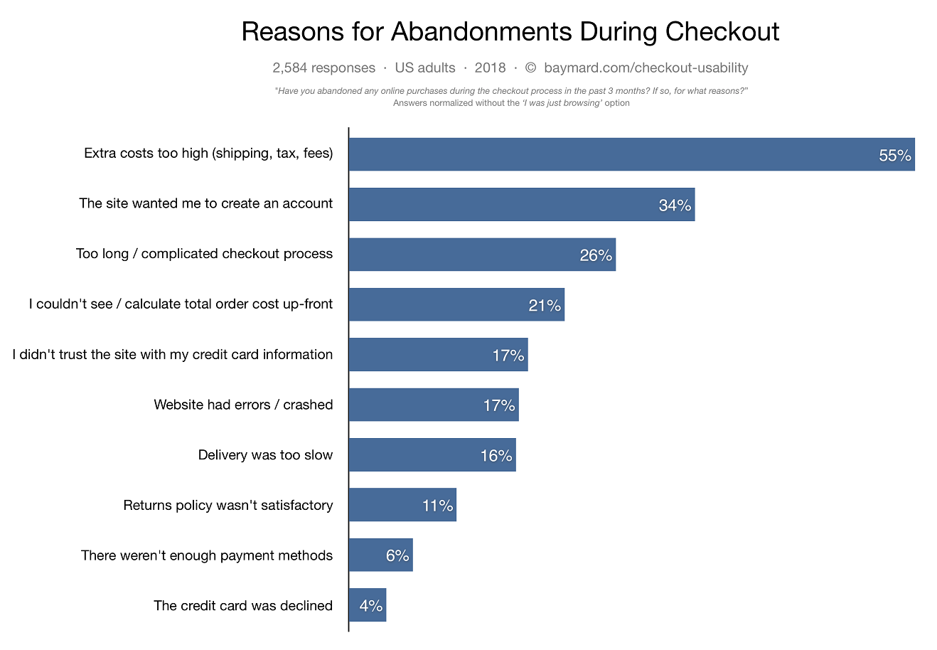
As you can see, two of the top four reasons for cart abandonment have to do with the price, while the other two have to do with a complicated checkout process.
One of the benefits of cart abandonment emails is that you can use them as an opportunity to improve your conversions by asking your customers why they haven’t completed their purchase. This is priceless information.
For instance, if your customers tell you that they have questions or confusion about a specific product, you can leverage this information to improve your product pages in response to their feedback.
If you have a lot of comments regarding “sticker shock,” you can try displaying your shipping and other fees upfront to reduce surprises.
Now that we know some of the most common reasons why visitors abandon their carts let’s explore how to determine your actual Shopify cart abandonment rate.
How to measure your Shopify cart AND checkout abandonment rate
Your shopping cart abandonment rate is the percentage of online shoppers who added items to their virtual shopping cart and then abandoned it before completing the purchase.
On the other hand, your checkout abandonment rate is the percentage of users who started the checkout process and then abandoned it before completing the purchase.
Both of them tell you important information about your funnel and how well it’s working at different stages.
Where to find these stats in your Shopify store
To find both your cart abandonment rate and your checkout abandonment rate on one page, navigate to the Online store conversion rate panel of the Overview Dashboard of your Shopify store:
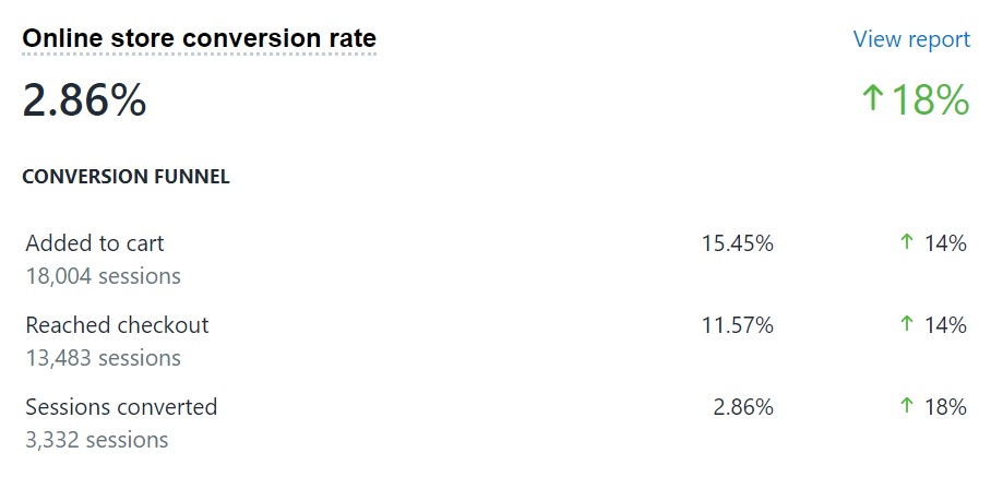
Then, to get your cart abandonment rate, run the following formula using an Excel spreadsheet or whichever software you prefer to use:
(Added to cart – Sessions converted) / Added to cart
And if you want to find your checkout abandonment rate:
(Reached checkout – Sessions converted) / Reached checkout
For example, if 100 people added your product to their cart and 25 of them actually purchased, then your abandoned cart percentage would be:
(100-25) / 100 = 75%
And if the total number of people who reached the checkout page after adding an item to their cart is 25, and only 20 ended up purchasing after that, then your abandoned checkout percentage would be:
(25-20) / 25 = 20%
Not a math whiz?
I’ve made a ready-to-use Google Sheet that you can simply copy and use to find your cart abandonment rate and see how much money you’re leaving on the table:
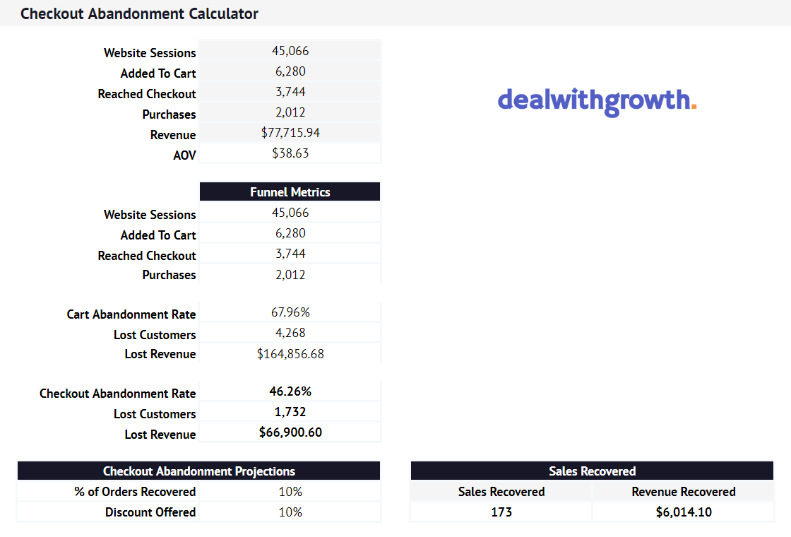
Get your Checkout Abandonment Opportunity Calculator here.
It’s super easy to use, so go ahead and calculate your cart abandonment rate now (or use whichever method you prefer).
Voila! Now that you’ve got your baseline, it’s time to start actually optimizing your abandonment emails.
Here’s where we really get into the good stuff, so grab something to take notes with and brace yourself. This will be wooooorth its weight in gold.
Best practices for Shopify cart abandonment emails
1. Focus on customer service
Your cart abandonment emails give you a chance to continue the conversation with a group of customers that demonstrated a high intent of purchase.
This isn’t about sending them a 15% off coupon a few hours after they abandon their cart, like this example below:
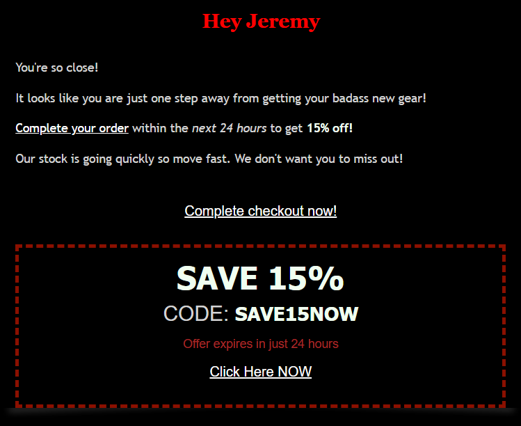
The example above is a perfect example of what not to do. Most brands make the mistake of sending an email 4-6 hours after abandonment with a discounted offer. Sure, it might help with conversions, but this is giving away your margin when you don’t need to.
Indeed, the visitors who would jump on a discount in those first few hours probably would have bought (with the help of a subtle reminder) anyway. All you are doing is training them to expect discounts. You’re also attracting coupon hunters, which are not the kind of customers you want.
So again, a cart abandonment email sequence is not about discounts, even if some of your emails will include them.
No, cart abandonment email goes much deeper than that.
It’s about creating a deeper relationship with your customers by asking questions, anticipating their needs, gathering valuable information about their concerns, and convincing them to purchase.
And how do you do that? By taking a customer-first approach.
If done correctly, a customer-first approach will allow you to gain insights that improve your overall buying process.
For a great example of how a customer-first approach looks in action, check out this email from SPOKE:

Notice how the email is friendly and to the point. It has an attitude of customer service—while being completely automated.
It encourages the customer to reach out for help on two separate occasions: once at the beginning of the email and once again to close it out.
Of course, they wisely include a call to action to return to the checkout page too (although it’s strategically sandwiched between the offers to help and answer questions).
They also help calm some of the customer’s potential concerns by reminding them of their free shipping and 100-day return policy.
Also, notice what they did not do. They didn’t jump to a discount off the bat.
Take note, and consider ways you can offer real customer service to determine their reasons for not buying before assuming it’s always the price. This won’t just help you to build a human connection with your customers and improve your buying experience going forward, but also save your profit margins.
2. Segment your cart abandonment emails
A powerful business strategy is to identify your most profitable customers and visitors. The beautiful thing about having an email list is that you have soooo much data to work with.
Almost every modern email marketing platform will let you get very granular data about your customers. This means you can see which customers clicked on a given email, visited your store, bought (and how much they bought)—the list goes on.
In fact, let’s take a look at some of the statistics regarding email list segmentation:
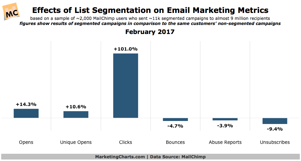
The study done by Mailchimp above looked at over 9 million emails and found that not only did segmented emails have a 14.32% higher open rate than non-segmented emails, but also a whopping 100.9% higher click-through rate.
When it comes to cart abandonment emails, an example of segmenting would be by cart value, cart size, customer type (new vs. returning), and whether or not a customer already has a discount applied (to prevent double-discounts).
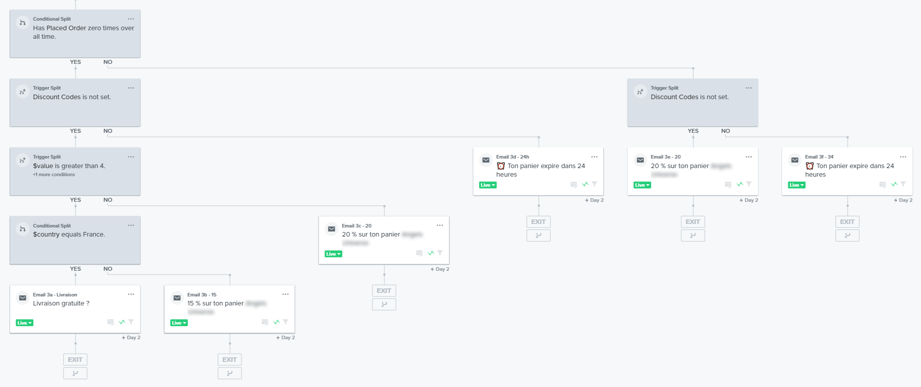
I like to get even more specific than that, such as offering a free shipping discount to first-time customers to make it easier for them to try the brand or product.
3. Nail the inbox experience
These days, consumers are inundated with emails. Projections show that in 2019, the average email user will get 126 emails a day. That’s a whole lot of emails and nailing your inbox experience is super important to get eyeballs on your email, instead of those 125 others.
3.1 Use a friendly From Name and email address
This is the first part of your email that your customer will interact with. Therefore, you want to make it as personal as possible. You could use your brand’s name as well as your first name, or one of your employee’s names.
A good rule of thumb is “Joe at Brand” or “Joe | Brand”, like this example from Beardbrand:
![]()
Make sure you avoid using no-reply@brand.com as it comes across as cold and impersonal. If you want to use an email in your “from” section, then do something like “support@brand.com” or “joe@brand.com”. This ensures that the customer can reply to your email and get help when they need it.
3.2 Make your subject line click-worthy
Rejoiner analyzed open rates and conversion rates from more than 7 million emails and found that the five subject lines below are super effective.

Let’s take the top one, which had the best conversion rates: “Your Buy Fencing Direct Basket”.
See, you don’t need to reinvent the wheel with this one. “Your [Company Name] Basket” is a proven winner. It makes it clear about who’s sending this email, and gives a friendly reminder about the cart they’ve left.
4. Assume your cart abandonment emails are going to be opened on mobile
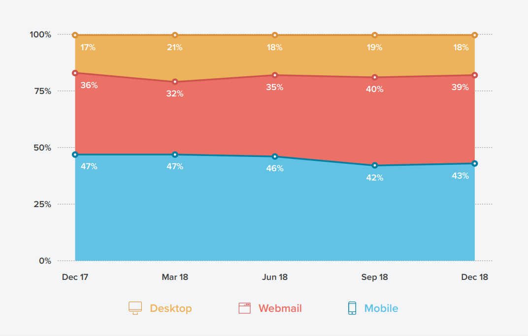
According to the 2019 State of Email Report from Litmus, 43% of all emails were opened on mobile devices in December of 2018.
And this is especially true for ecommerce stores. Here’s an example from a client of mine:

You read that right. More than 91% of emails are opened on mobile devices for this Shopify store.
And guess what…
Your customers are looking for emails that are optimized for mobile. And if you’re not giving them what they want, they’ll just delete your emails:
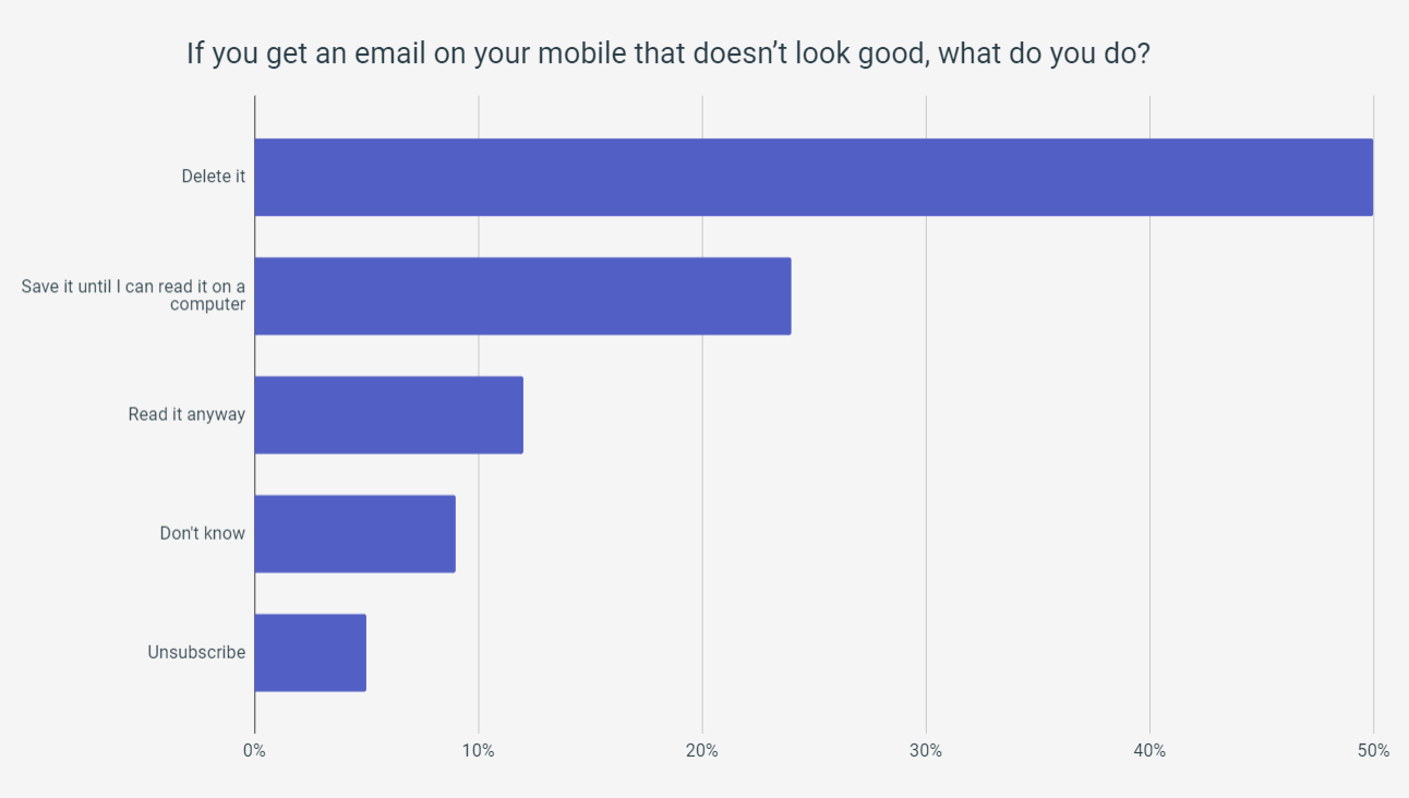
Here are some quick tips to make sure your cart abandonment emails look good on mobile:
- Body copy: 16px+
- Headline: 22px+
- Buttons: 44px by 44px
- Space: 40px+
- Calls to action: Touch targets (make sure they’re tappable)
5. Personalize your cart abandonment emails
I’ll give you one reason to use personalization in your emails: it leads to 6x higher conversion rates.
But the key is in the details.
Don’t just personalize someone’s name. Try to personalize products too, and set it up so that your emails dynamically insert the specific product that your customer had in their cart into the cart abandonment email itself.
This email by Skinspace does a great job of this in their email below:
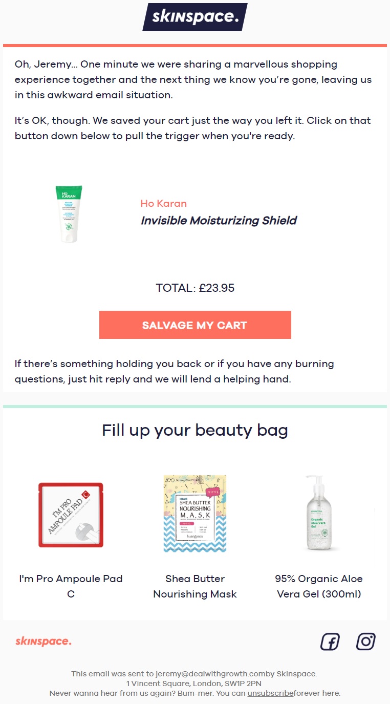
The email matches the look & feel of the product page and prominently displays the image of the product to remind customers of their initial excitement. A picture always speaks louder than words.
6. Do not send all image emails
Like, seriously. All image emails in 2019 are no-nos. You should always put important information in text form, and use images as a way to enhance it. Not the other way around.
Here’s your friendly reminder for you #eCommerce folks that image based emails look like this if you don’t do something about it.
(so do something about it) pic.twitter.com/pjkpnn24sw
— Val Geisler ? (@lovevalgeisler) 9 April 2019
And with the changing landscape of technology, this is more important than ever.
For example, Amazon recently updated Alexa in December of 2018. Now, Alexa can read and even delete your emails. As Kevin Mandeville pointed out, Alexa will read the sender name, subject line, text, and even emojis in an HTML email out loud.
BUT, it will ignore images and HTML attributes like alt text, just like a reader wouldn’t see any images if they viewed your email with images turned off.
7. Have a clear call to action
Calls to action for email marketing don’t need to be over the top, bold or crazy in any way.
This isn’t a high-pressure sales letter for an internet marketing course, so avoid showing a big “BUY NOW”. Instead, choose something a little more descriptive, exciting, and relevant to the user experience.
Here are some good calls to action for cart abandonment emails:
- Return to My Cart
- Complete My Order
- Finish Checking Out
- Reclaim My Cart
A good rule of thumb when it comes to writing a call to action is to put your reader in the midst of the action.
8. Send multiple emails
According to Experian Email Benchmark Report, customers were 2.4 times more likely to convert when they received more than one cart abandonment email.
In addition to that, they also made repeat purchases 44% more than their counterparts who did not receive multiple emails.
And then there’s the Abandoned Cart Benchmark Report by Klaviyo:
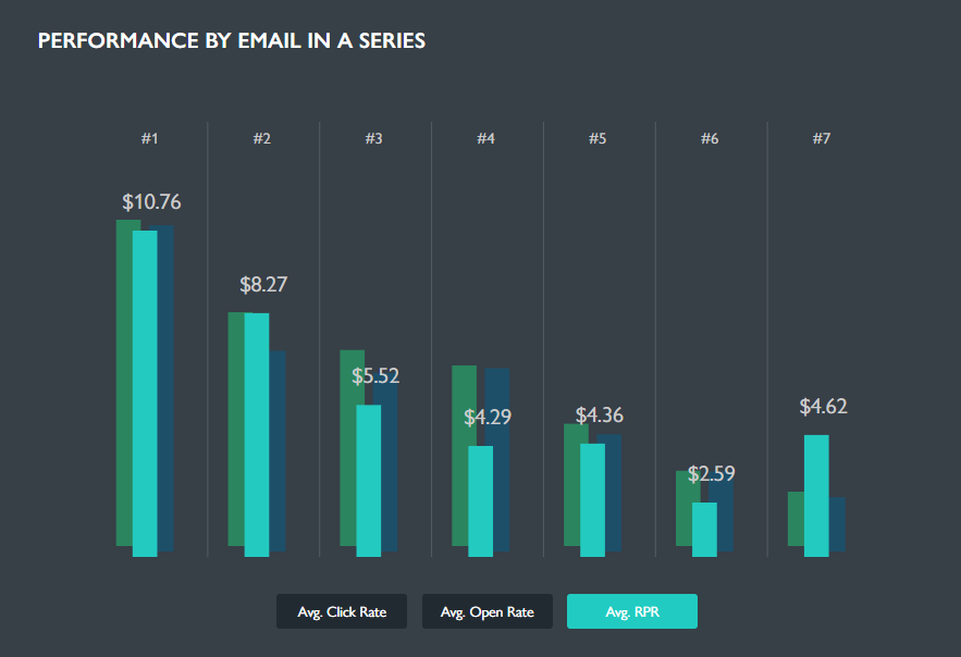
According to their abandoned cart benchmark research, you should send 2 or 3 abandoned cart emails in order to optimize the three key metrics of open rate, click through rate, and revenue per user.
This can get tricky, but don’t worry. My proven email template is coming up soon, and it will show you how to do it the right way so you can maximize profit without cannibalizing conversions.
But for now, just keep this in mind: always send more than one email to rescue abandoned cart revenue.
9. Don’t discount on email #1
Sure, you can usually boost your email’s conversion rate if you give a discount immediately, but you’d be sacrificing margin and worse: you’d be training your customers to expect coupons.
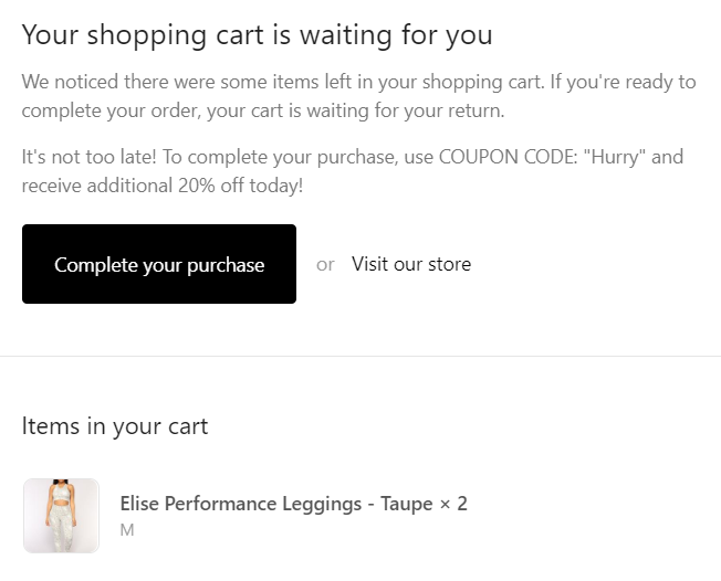
Eventually, they will just abandon their cart to receive a discount for future orders. In emails 2, and 3, you can start to introduce coupon codes in order to incentivize people to come back and purchase (if they have not yet done so after 24 or 48 hours).
10. Send the 1st email 30 minutes to 1 hour after abandonment
Proper timing is essential in email marketing. This is especially true if your visitor is shopping around on other sites with similar products to yours.
According to a study ran by Rejoiner, the best time to send the first email is between 30 minutes to 1 hour while your customers are still on their phone and haven’t bought from a competitor yet.

Any sooner and it might be too high-pressure. If you wait longer than that, you might risk losing the sale to another store.
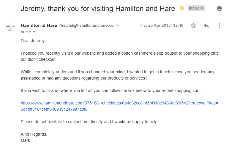
And remember, now is not the time to offer a discount. Just reach out with an attitude of helpful customer service, like this great example from Hamilton and Hare:
My go-to setup for recovering over 15% of lost Shopify sales with cart abandonment emails
Whew! That was a lot of info to process…
So, without further ado, let me show you my go-to cart abandonment email sequence that brings it all together. That way you can have a more comprehensive view of how the best practices look.
The case study below is from a client in the beauty industry that is recovering between 17 to 20% of sales from their lost carts. Let’s dive in.
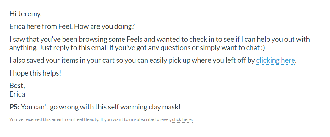
Abandoned Cart Email #1
- When to send it: 30 minutes after abandonment.
- Email Type: Plain text.
- Subject line: Can I help?
- Focus: Customer Service.
Key points:
- Brief and helpful. The sender asks if they can help the recipient first before including a call to action to return to cart.
- Plain text email increases the chances of landing in the reader’s inbox—deliverability is key here.
- It’s personalized (“Hi Maria” is always better than “Hi there”).
- Reminds shoppers to finish what they started by including a direct link back to their cart. Never underestimate how indecisive and distracted the modern consumer is.
- The casual nature and plain text design (or lack thereof) both imply that Erica sat down at her computer to write a personal note. This is reinforced by the P.S. that dynamically pulls the product type from the cart.
- Reassures that the product they’ve left – in this case the pumpkin walnut facial cleanser – is a great choice. Most people have low confidence in their own ability to make a good decision. Remind them that their first instinct to add your product to their cart was correct.
- No discount yet—maybe price wasn’t even a concern for her. She could have just been distracted by a phone call or something else.
Abandoned Cart Email #2
- When to send it: 24 hours after abandonment.
- Email Type: HTML.
- Subject line: Your Feel Beauty basket
- Focus: Branded Classic. Play up your brand’s strengths.

- Branded cart abandonment email that showcases the product with a stunning hero shot.
- Matches the look & feel of the product page to remind customers of their initial excitement.
- “Return to My Cart” instead of “Buy Now” or other hard-sell tactics.
Mentioning and linking to the delivery and return policy. It’s time to reassure them that they have nothing to lose. - Support is one click away to encourage customers to get in touch with any questions. You don’t want to lose a sale simply because they couldn’t get in touch with customer service.
- Still no discount. That’s coming up next.
Abandoned Cart Email #3
- When to send it: 3 days after abandonment.
- Email Type: HTML.
- Subject line: 10% off your Feel Beauty basket
- Focus: Branded Classic with a deal sweetener (discount) for new customers.
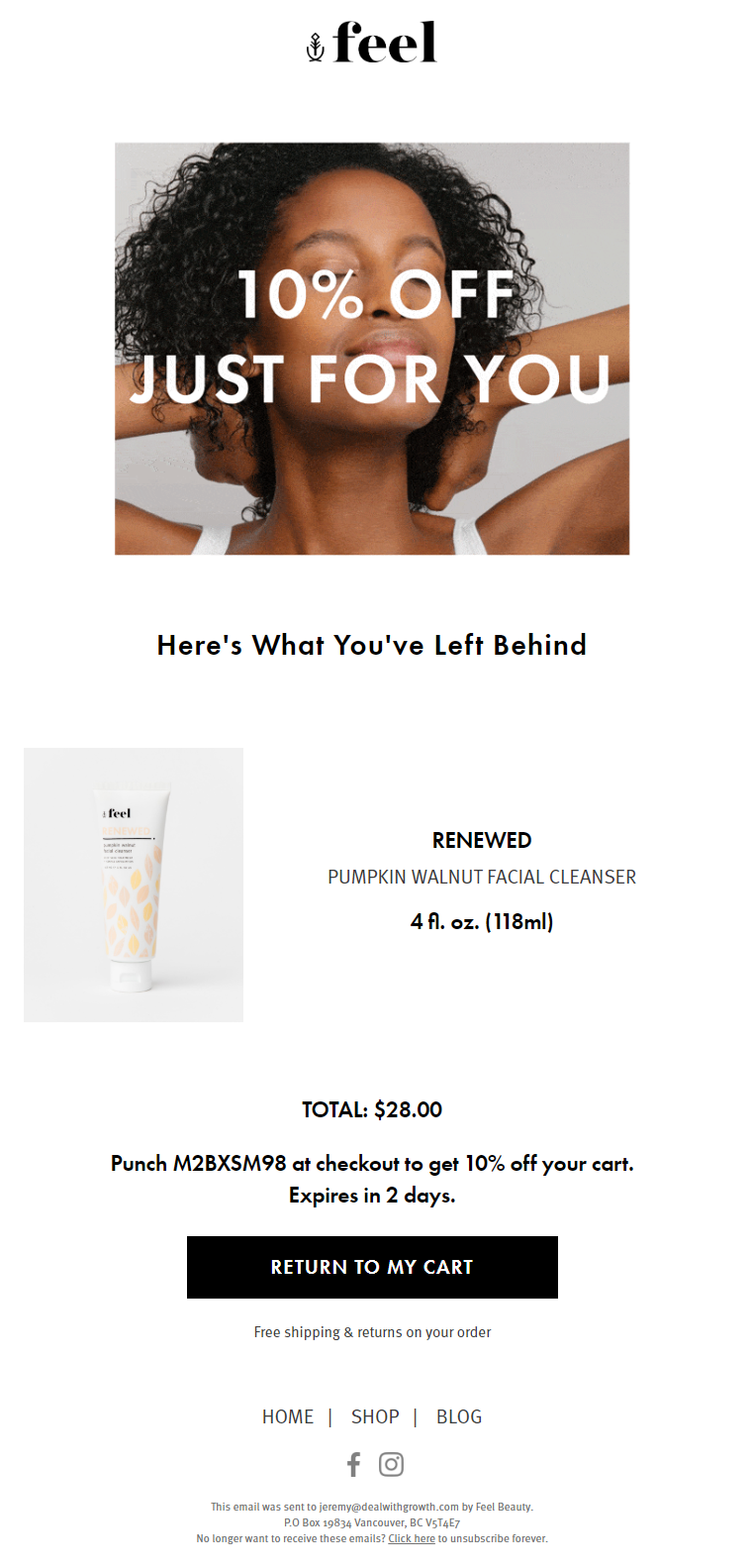
- Another branded email that showcases the product front and center.
- It matches the look & feel of the product page to remind customers of their initial excitement.
- Unique one-time 10% off discount for new customers only (uses segmentation).
- Expires in 2 days so to create a sense of urgency and increase conversions.
Cart abandonment is just the beginning
Now that you understand the reasons behind abandoned carts and the strategies to win would-be customers back, you have a huge opportunity on your hands.
You can either let your visitors’ carts stay abandoned or use the framework above to create memorable customer service moments and convert up to 15% (or more) of your abandoned carts. All with a few strategically created emails
If you run a Shopify store and would like to find out if I can improve your conversions, sales, and profits with cart abandonment emails, get in touch. I’d love to help.
